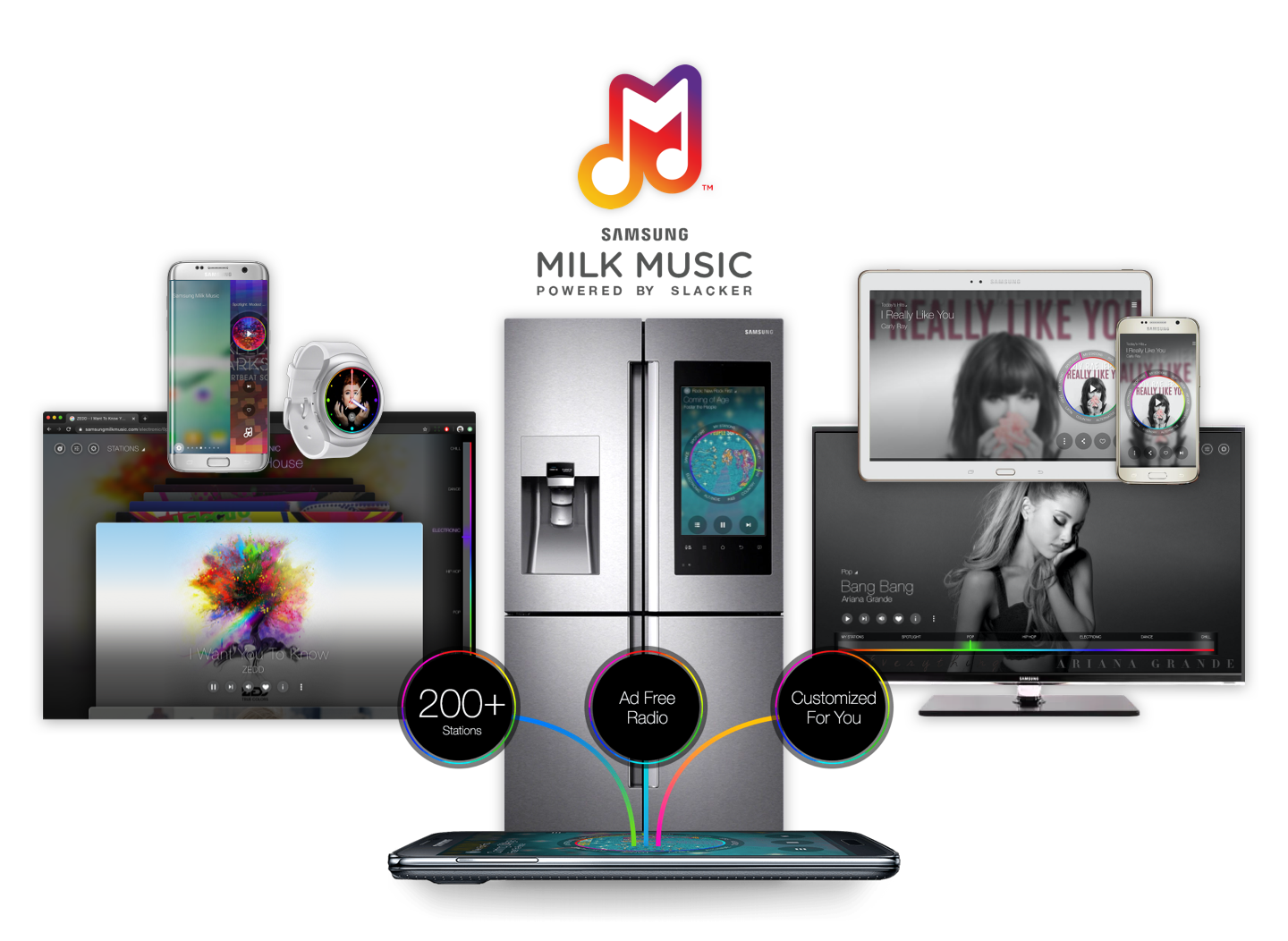
Stream Music With A Wearable

Design a version of Milk Music Streaming Music Service for a new Wearable Gear Device.

The App must be completed will be burned into the device ISO.

The App can also be installed from the Gear Apps Store.

This was a brand new device and we had to start immediately to make the release date. We had no documentation on how the OS interface was going to work or a demo device to play with.

Through conversations and a few drawings we knew it was going to be a “round” update of the Samsung Gear Wrist Watch…

  • Round Wrist Watch
    • 42.3 x 49.8 x 11.4 mm ( W x H x D )
  • Rotary Dial
  • Touch Screen
    • 30mm
    • 360 x 360px
    • 302dpi
  • LTE Data Plan
  • Tizen OS
  • Unknown OS Controls
    • How would the user navigate the OS with the touch screen?
  • Unknown Rotary Dial Controls
    • What would the dial control in the OS?
  • Unknown Hard Buttons
    • How many?
    • What would they control?

Return On Investment

Device Value – Adding free, easy to use streaming music to a wearable. Out of the box, it adds functionality and entertainment to the device helping drive sales.

Brand Value – Samsung will continue to have the only Wearables on the market that have quality apps consuming wireless data. Showing they are a leader in wearables and mobile technology.

Empathize

Personas

Due to a tight deadline, I took Personas (Gen Y living in a metro area) based on the Android App and modified them to be people who are “on the go”…

When I am exercising or commuting, how can I listen to the music I like without a phone?

We have a wearable for you with free streaming music.

I don’t want to take complex steps to play music after I open the box.

It will play music on a “Guest Account” out of the box.

If you want to hook up your Milk Music Account it will be easy taking advantage of pairing to the phone to navigate setup. After that never touch the phone again.

I don’t want to get lost inside the app trying to listen to music I like, while I am “on the go.”

We will simplify the experience from our flagship Android App removing features that users “on the go” do not need.

Define

User & System Stories

I led the sessions with the Lead Engineer, Project Manager, and  Product Manager.

Epic – Stand-Alone Mode

User – As the User, I can choose to stream music from the device and use LTE Data (standalone)

User – As the User, I can choose to pair the device to my phone via BT and use the phone’s data.

System – As the system, if the device has a data plan, is not connected to wifi and become unpaired from the phone;

I will pause the music and display dataMessage_01.

User – As the user, I can choose to not repeat this message.

I am constantly walking the business, directors, designers, and even potential users through the stories to make sure the product makes sense and meets the Design Challenges.

Ideate - Design Process

Fast, Cheap, Out of Control

How can I design multiple ways to solve a problem extremely fast? Draw it, cut it out, wear it and let it live in the world. Now is it still a thing? I sketched multiple versions of the app’s 5 main screens at 30mm in about 4 hours.

I presented thumbnails of all the main screens to the UX Director by cutting them out and taping them to my watch. I described to him what each interaction would be.

Cut Out 1
Cut Out 2
Cut Out 3

We discussed the pros and cons of each solution. I quickly redrew some of the thumbnails and rewrote some of the interaction descriptions until we agreed it was time to get each screen made in design software.

Stake Holder Presentation

The best way to present to our stakeholders was with an animation test in After Effects that took 2 days.

Assumptions Made

The animation test was created before the device control interactions were known and before the story mapping was completed.

Gear S2 OS – Turning the Dial navigates screens horizontally.
Milk Music App – Turning the dial changes stations vertically.

The early animation test lead to assumptions and impacted the usability of version 1 (see user testing).

Sprint Planning – 2 Sprints Ahead

With the stakeholders excited and the product defined, we begin to map out the first development sprints. I always strive to have the design and assets locked in 2 whole sprints ahead of developers throughout the whole production.

Wireframes – Interactions Defined

Wireframes showing the “Happy Path” are created very quickly to show the interactions inside of our user story tickets. As the wireframes  become more detailed, I show all failure states and messages that can occur.

Clickable Wireframes
Design To Size

As I build the wireframes, I create the layouts to be correct as possible before moving onto to visual design. This makes it easier for everyone to understand base sizes and spacing of layouts while giving us a jump on the style guide.

States Defined

As I get further ahead of development and the “Happy Path” is well defined. I go back and create decision trees for all the different states of the experience and messaging the user will encounter.

As the user when I want to run Milk Music in Companion Mode I must be paired to my Samsung phone.

Design System

I begin to get a custom design system based on the Milk Android System.

Like Material Design (Android), Interface Builder (iOS) or Boot Strap (Web) I start by defining elements and the rules for using those elements.

Because of the device shape, size and computing power the UI visual effects like background blur and transparencies ended up not working. The app ran extremely slow causing low frame rate when transitioning between screens or scrolling lists.

Helvetica Neune used on Android appeared blurry on Gear S. After fonts and different type formats were tried, I went with Lato. I defined different weights to give the same feel as the Android build.

Simple UI .png transparency layers were used instead of programmatic effects. Button styles were simplified because of no blur effect. Rainbow dial branding was a must-have and was redesigned to fit the device.

Components & Widgets

Using elements from the Design System begin to come together as Components and Widgets.

These are used in creation of the screens or containers with the engineers.

Design feedback from the team and UX director is constant through out the visual design process.

Focussing on seeing the album cover art and the UI without using background blur on the Album Cover Art or on the UI Backplates.

UI testing done with extreme Album Cover Art known to make UI readability difficult.

Asset Creation

Worked hard on the creation of pixel prefix assets with lots of testing and zooming in way to far on the design software.

One Button Push to Git

With the help of Devops I design a plug in for Sketch that pushes all assets marked for exportation to a separate branch in SVN.

Design Documentation

Throughout the design process, the Design Specs and Style Guild are constantly updated in Confluence and are treated as live documentation.

Once we are far enough ahead and we agree on a Version of the product Confluence, this makes it easy for me to keep documenting while production runs on a version of the design. For large products and teams, this is usually a must, but in this case, the team was keeping up and comfortable with live documentation so we never needed to Version the Design Specs.

Confluence Design Documentation Setup

I worked with DevOps and really pushed what Confluence could do for our live design documentation.

  • Wireframes – Gliffy
  • Decision Trees – Gliffy
  • Written actions describing each action the user can take.
  • Links back to the Jira stories.
  • Videos of animation tests
  • Embedded screens from Zeplin, with Links back to screens in Zeplin.
  • Jira Ticket Status for each story.
  • Link to Git Asset branch.
  • Sketch to Git Asset branch export script.
  • Git Asset Branch displayed in the table. Names, dimensions, descriptions, and the asset themselves can be downloaded per screen.

Design Document Deliverables

The Product Life Management division required a design document of the product. I used a custom Confluence template that exported out to PDF for submission. By the time we were done, the design document was over 80 pages.

By using Confluence and keeping the documentation live it was very easy for me to export out a new version with a change log to PLM.

Prototypes

Prototypes Without Using Engineering Resources…

I make prototypes of the product’s “Happy Path” in software like Invision Studio, Framer, Pixate, Adobe XD or Sketch and test with users.

On large products, I break out individual flows and features into multiple prototypes for easier management and user testing.

Further Definition

I worked making small prototypes in Pixate to better define transitions and animations.

Animation Spring Test
Favorite Animation Test

Android Prototype Fast

Fastest way to get a prototype was to build an Android version, running on phones, designed to be the same size as the watch.

Then we began iterating on 3D printed versions of the device called “Lunch Boxes.”

Milk Android Prototype v1.6

Used a “Press and Drag” on the Dial
(Grey gear on the outside) to simulate the Gear S2 dial.

I’m Always Testing

I submit system bugs, UX Bugs, and provide feedback to the team.

In this Test Video, we can see there is a BT syncing issue with the “Lunch Box” while it is paired to the phone.

This was a major bug with our flagship product, the Android App. The Android was not staying in sync with what was playing on the Gears S2 while in Companion Mode.

I confirmed the Android App was not syncing by pairing the Gear S that was already in the market place. Sure enough, same syncing problem confirming it was happening with that device as well.

The main Android support team was able to quickly push an update to the App and fix the problem.

"Lunch Box" Prototype Testing

Bug – Android App not syncing with Gear S2 in “Companion Mode”.

Testing On First Watches…

As the watch progressed in form adding a “Back Button” the OS also evolved becoming more responsive and optimized improving performance. 

In this this test video we’re still having touch issues and performance navigating the giant flat list of stations is just not smooth.

You can see that I mess up trying to adjust the volume because I forgot to tap the icon, a problem that shows up in user testing.

Testing On First Watches

User Testing

Guerrilla Around The Office

With the interaction design and the visual design mostly in place, it’s  time to do some testing around the studio with the Android Prototype. Getting results around the shop is hard because everyone knows the product and tends to want to make you feel good about the design but it is a place to start. 

What we learned from taking this around the office:

  1. Mental model of the design makes sense.
  2. Touch targets seemed to be the right size.
Android Prototype_02

Group Testing

Invite the whole team, order lunch, and test. Take all the Bugs and UX Bugs that we find together and get them on the whiteboard. Prioritize and get them into backlog ready for the next sprint planning.

User Observation

I asked colleagues how they use their wearables at work, at the gym, on the train and at home.

Analytics

I reviewed the Android analytics and discovered that the most used features are Play / Pause (a given), skipping a song (a given), and then Banning a Song (surprising).

Why is “Ban Song” used so much?

I took this finding and did some user interviews discovering:

  1. When a song is bad the listener is really offended. This causes the user to take instant action, banning the song.

  2. Banning is how users prefer to customize stations over the sliding menu and over favoriting a song.

    1.  Users find the sliding menu is a bit abstract.

    2. Favoriting a song does not directly tell them that more will be adding to the station like the one they just favorited.

  3. The user is listening to songs that they like, but they really really have to like it in order to take action.

  4. Free account users only have 6 skips. 

  • Play / Pause

    The most used feature (given).

  • Ban Song

    Second most used feature, very surprising.

  • Skip Song

    Third most used feature.

  • Favorite Song

    Fourth most used feature.

Testing With First Watches

1 on 1 user testing with Samsung Android users that have never used a smart watch.

User Findings - Empathize & Redesign

As a Milk Music Gear S2 (v1) user I…

  1. Launch App (Unlock watch, cycle through widgets, choose “Apps”, navigate apps, tap Milk.)
    1. Problem – I cannot enter the app easily after the watch screen locks.
      Solution – Shortcut on Clock Face if Milk is running.
      Solution – Create Widget. Brings Milk up 1 interaction level in OS and ready to use.
  2. App Navigation
    1. Problem – Turn the Dial (Bezel) – Why the station list is up? This should navigate screens horizontally as it does on the watch.
      Solution Make turning the dial navigate the app just like the OS. 
  3. Station List
    1. Problem – Tapping the station metadata, expecting the station list.
      Solution – Tap the song metadata station list pops up.
    2. Problem – “Swipe Up” Affordance for a list is not there like in the OS.
      Solution – Create a “Swipe Up” affordance just like the OS.
  4. Station Navigation (500 Station Looping Flat List)
    1. Problem – Scrolling past their intended choices over and over.
      Solution – Stop scrolling at the end and beginning of the list.
    2. Problem – Scrolling Performance – Jerky causing the stations to be hard to read.
      Solution – Call the music service and load all the station names as soon as the app starts, instead of on the fly when the list is accessed.
  5. Change Station (Users that do change stations are usually staying within the genre and changing the station when they run out of skips.)
    1. Problem – Users do not change stations often.
      Solution – Make skips easier to get to because it is being used more than change stations. 
  6. Can’t Navigate by Genre – When users truly want a change in music, they change genres. Making it more important than just changing a station.)
    1. Problem – Tapping Genre in the station list expecting to navigate by Genre.
      Solution – Tap Genre to navigate by Genre.
      Solution – Use the back button on the watch from the station list to get the Genre List. 
  7. Song Meta Data Not Actionable
    1. Problem – Tapping the Meta Data expecting the ability to navigate stations.
      Solution – Bring up the Station List when Meta Data is tapped.
  8. “Ban Song” Missing – Third most used feature on the Android App. They are using this to “Fine Tune” stations they like.
    1. Problem – Users want to ban (remove) a song from the station, more than favoriting.
      Solution – Add a Ban Song modal. Tell the user with words, and animations and what is happening before the Banned Song is Removed and Skipped.
  9. Adjusting Volume – All users are adjusting the volume a lot and it is hard to do!
    1. Problem – Milk Music service is not mastered.
      Solution –  Create a service option “Normalize Volume” that would always be on for the Gear S App.
    2. Problem – Watch OS and Milk App both take 6 steps!
      Solution – Short cut on the Watch Clock Face to adjust the volume.
    3. Problem – Milk Music App. Users did not know they needed to tap the volume button to get into volume mode. They would turn the dial and the station list would come up.
      Solution – Tell them with words “Tap To Adjust Volume”.
  10. Favoriting Poor Indicators
    1. Problem – Favoriting. Users had a hard time understanding what favoriting a song actually does. They would just toggle the button on and off.
      Solution – Use words to tell them what the result will be.
  11. Small Touch Areas Work
    1. Discovery – Users do not miss tap on the much smaller icons of the OS.
      Opportunity – Bring the most used actions to the home screen.

Widget

As the OS was being developed and tested with users the idea of a “Widget Section” developed.

The “Widget” section of the OS allows for easy control of the user’s favorite apps.

The widget was set a requirement to have Milk burned into the device and was just what we needed to help with some of our interaction problems uncovered in user testing.

The first version of the widget was just Milk Music with a deep link to the App.

The second version has a Skip and Play/Pause button two most used features. Tapping the metadata opens the app.

v2 - Testing Widget
v1 Widget - Deep Link Visual Tests
v2 - Launch App / Back Button

Launch

App Store

Instructions

I designed the store to show off the features of Milk Music, the new device design, and explain how Milk Music works.

I accomplish all three by turning the store photo into an instruction guide, with a nice close up of the interface, hand-drawn instructions that looked like they were drawn over the photo. 

Style

The hand-drawn instruction style referenced the legendary photoshoot Marilyn Monroe did with Bert Stern in 1962. She crossed-out images she didn’t like with marker.

The hand-drawn instructions are in high contrast with the clean photos, causing the viewer to understand “this is how I run Milk Music”.

The Marketing Team loved this design style and we continued to use it with printed Milk Music marketing material that was inserted into the box of the Gear S2.

Assets

I supported the Marking Launch Team throughout the entire launch of the app and the device, creating and managing all the different sizes for Google Play, App Store, Samsung Galaxy Store, and printed marketing material.

Rough Launch with v1.6

Because the app was such a difficult app to develop and get approved in such a short time we had to sick with the v1 design because it was bug-free and ready for the assembly line ISO.

This caused us to really suffer on some of the user reviews earning too many 1 and 2 stars reviews.

Those reviews fell in line with our user test findings and we quickly pushed the v2 update after the 3rd week of device launch. The 1 and 2-star reviews stopped coming in but having a launch version that was just not up to usability standards cost the app a solid 4.5 average user reviews.

Summary

Achievements…

Number one app in the Galaxy App Store in the US and Korea.

Highest App Engagement Time of the Gear S2 (coming back into the app to skip/ban songs).

Help set OS and App Design standards like font sizes and swipe up menus.

Development of User Finding Papers proving that Gear S2 UI controls and sizes worked for North American markets.


Milk Music Experience

I am very proud to be part of a team that created products where the UX was the star of the show…

Phone Tablet Wearbles Browser
Design

Design Critique

Group Testing V1

Group Testing V2

User Testing V2

Focus Groups V2

Asset Creation V1

Accessibility V1

TalkBack

User Testing

S7 Edge Panel

Live Streaming Sports

V2 Research

V2 Responsive Design

Portrait

Landscape

Live Streaming Sports

Gear, Gear S, Gear S2 V1 - 2

Research

Story Mapping

Wireframes

Mockups

Asset Creation

Rapid Prototypes

User Testing

Marketing Assets

Live Streaming Sports

Wireframes

Asset Creation

Animation Tests

Change Station Controls V2

Management

Style Guide Site

Spec Site (Confluence)

PLM Documentation (pdf)

PLM Requests (Fixes)

Stake Holder Sign Off

3 different sized tablets

Spec Site (Confluence)

PLM Documentation (pdf)

PLM Requests (Fixes)

Gear, Gear S, Gear S2 V1 - 2

Spec Site (Confluence)

Scrum Facilitation

Ticketing System (Jira)

Test Cases (Test Rails)

PLM Design Documentation (pdf)

PLM Requests (Fixes)

Spec Site (Confluence)

PLM Documentation (pdf)

PLM Requests (Fixes)

TV Home Fridge BMW
Design

Design

Asset Creation

User Testing

Code Name HIVE (SmartThings Hub)

Design

Asset Creation

User Testing

Research

Story Mapping

Wireframes

Mockups

Asset Creation

Rapid Prototypes

Branding Assets

Usabilty Testing

Management

Ticketing System (Jira)

Spec Site (Confluence)

PLM Documentation (pdf)

PLM Requests (pdf)

Ticketing System (Jira)

Spec Site (Confluence)

PLM Documentation (pdf)

PLM Requests (pdf)

Ticketing System (Jira)

Spec Site (Confluence)

PLM Documentation (pdf)

PLM Requests (pdf)

Ticketing System (Jira)

Spec Site (Confluence)

PLM Documentation (pdf)

PLM Requests (pdf)

Amazing Leadership & Awards


Milk Music Design was lead by Neil Evette (UX Director)

Community

Years after the service has been shut down I still run into comments on the design…


Comment – Sneakersislife, “Slacker radio is basically the same thing.”
 

Reply – TheAdept, “It is but the UI of milk was gloriously easy to navigate and you also had the ability to choose the percentage of the mainstream, popular, and your favorite songs that were played.”

 
sean@seancurreydesign.com
(415) 961-1890
© All Rights Reserved 2020