


Suspected Asthma Patients should have their diagnoses confirmed with spirometry.
Primary Care often prescribes asthma medications without a spirometer test.
COPD and Asthma are sometimes misdiagnosed by primary care physicians.
Chest pain, tightness, or difficulty breathing are symptoms that can be related to other diseases like allergies, anxiety, or heart conditions.
Misdiagnoses in a patient population could be over 33 percent nation wide.
Once Asthma has been diagnosed, getting control with the proper medications can be difficult. Patients will be prescribed different brands of medication or have the delivery system changed throughout their treatment.
“Rescue Inhalers” relieve an exacerbation (Asthma Attack), but are very commonly referred to by the generic name “Albuterol”. On the inhaler, the “Brand Name” is usually the most prominent. Some brands do not show “Albuterol” unless the canister is pulled out of the dispenser and the fine print can be read. When a pharmacy switches between brands it can cause patients to mix up their Control and Rescue inhalers.
Improper Inhaler use is a common problem. Methods for teaching patients how to use inhalers are inconsistent. Patients who have been using inhalers for years forget how to properly use them or take shortcuts.
One doctor told a story of a patient he watched from his office window empty his inhaler into the air in the parking lot before coming into the office. He filled out the Asthma Control Questionnaire as if he had been taking his medication. Then showed the doctor the empty inhaler as proof he had been taking the medication.
The doctor felt his motivation was that the patient didn’t want to disappoint him.
Asthma symptoms and the risk of exacerbations goes up when the Air Quality is poor.
One Physician told us about a patient who started off barely able to get out of bed. Her “Level of Good” was so low that she would comment on how she had such a “Good Day” when she did the dishes.
During her next visit, she was complaining about how “Bad” her day was because it took her so long to check out of the grocery store and to get her hair done. Her new “Level of Good” had been raised so high because she was leading an active lifestyle again.
A higher level of good can also be a danger point in the patient’s progress because when they feel better they will go off their medications and begin to regress back.
Asthma Control Questionnaire (ACQ) every 1 to 6 months before an office visit. Often the patients do not fill out the ACQ accurately about how they are taking their medications.
Engaging with our partnered Healthcare Networks we saw EMR systems with…
The main reasons why these apps or dashboards were not being utilized was…
A way to form new program partnerships and new representative contacts.
If we create patient programs that are not based on AstraZeneca medication it will show that we care about all patients regardless of what they are prescribed.
Insurance providers reward Healthcare providers for the quality of the patient care they deliver instead of the number of tests and health care services they provide.
The patient data that is coming into the disease platform can help prove that our medications are providing better care to specific patient populations by measuring patient outcomes such as medication adherence, increase in symptom-free days and a reduction in emergency room visits.
Can we provide representatives new and meaningful data to discuss with Physicians?
Because we have shown we care will physicians prescribe AstraZeneca medications first?
Can we form new partnerships for research and development?
Specific Patient Populations
Improve Upon Claims Data – Not just a single point in time.
Discovery of New Treatments
Discovery of New Markets
Refills – A better understanding of what happens leading up to prescriptions not being refilled.
The cost of having IT develop or to pay for Apps and EMR modules from the leading EMR provider in the industry Epic is extremely expensive.
Propeller Health has the most traction with a sensor that goes onto the patient’s inhaler, a patient app reporting data to a machine learning platform but cost the Health Care provider or Payer between Customers pay a monthly charge of about $15 to $25 to sign up their patients. That data does not go into their existing EMR Dashboard.
A number of our partners deployed their EMRs in different ways across their HealthCare network.
Example Healthcare Network –
1. Pulmonary Practice could be treating patients who have developed Asthmatic Bronchitis. IT has Epic EMR deployed on a specific server type with specific dashboard modules activated.
2. Allergy Practice treating Asthma related to allergic reactions. Different IT group has deployed Epic another server type and does not have any dashboard modules activated.
Presentation to our stakeholders what the product will do and how we can leverage existing Disease Platform Apps and Dashboards. Audio stitched together from the presentation.
Disease Platform Apps – The desired feature set closely resembled other Disease Platform apps, so I was able to pull Components and Widgets from our Framework.
Partner Asthma App & Care Team Dashboard – Edge has been in use at Geisinger Healthcare Network for over a year. The team collected quantitative data on how the app was performing in their patient population. The dashboard is in use by their Care Team and qualitative has been collected around its functionality.
Patient Mobile Dashboard – I referenced Apple Health’s Dashboard Architecture. We used Disease Platform Framework InfoGraphics Widgets.

Full Breath Prototype inherited organizational structures from the other apps that were designed to monitor data coming into the app from devices. Not have the patient input data or see their history.
Geared towards internal and external applications that are AstraZeneca “Branded Experiences.”
Elements, Components, and Widgets in the Sketch Libraries relate back to the Framework.
Allowing for experiences to be rebranded and reconfigured into Partner Branded experiences (“Unbranded Experiences”), or for reuse in new experiences.
This design system defines:

Design Components to be responsive and flexible using our Framework Elements.

Test the Container (Screen) interactions, and readability with our Framework Grays.

If I am able to find the Components in the Framework Directory and help with styling, then we have built a successful component.

Working React Native iOS App sending data to the Web-Based Dashboard.
Usability Plan – Created by our team’s UX Researcher.
Interviews Recorded – App screen gestures and audio was recorded.
Task Accomplishment Notes – As he interviewed each patient’s performance per task was recorded and scored from; Frustrated, Useable, Enjoyable
Task Score Cards – Each task gets a score based on Jakob Nielsen’s 10 Usability Heuristics.
Post Testing Discussion…
Why – Why did each score end up the way it did good or bad?
Possible Solutions – Quick notes how we could fix the problem or improve the task.
System Usability Scale – Filled out by each patient at the end of the session. SUS Calc
| Day 1 | Day 2 |
|---|---|
|
|
|
30 - 45 min. each |
|
I played the role of the Care Team member making sure data was coming into the Dashboard and returning messages from the patients.

Categories – Too much in and out of the categories looking for what they wanted.
List Ordering – The ordering of the list by “most used” or perceived “importance” was a mistake. What is important to one patient is not important to another. This caused the patients to pause because their first instinct is to go alphabetically.
Missing Symptoms & Triggers – We are missing items from our list, like Tightness of Chest.
Results – Frustrating
Unknown Categories – Cannot see all the categories at once so the patient keeps flipping back and forth.
List Limits – Limits the number of options in each category, it would turn in a scrolling list inside a card.
There are too many symptoms and triggers to choose from.
Patients are telling us they would tend to track the same ones over and over.
An alphabetically ordered flat list might cause them to pause at first, but once they learn the list they would simply scroll down pick symptoms, triggers, and medications to track.
Because the prototype was so rough I had the design files open and began to work on glaring issues.
I communicated the changes I wanted to the front-end lead. Because of our front end framework was in place he was able to easily push new builds to the development branch.
In between patients, I woudl discuss the changes with the UX researcher.
I we agreed the changes were an aprovement and not effect testing he we would update the patient device and be ready for the next patient.

Great way to tune an app for a specific patient population or health care network by using the terms the patient’s doctors use.
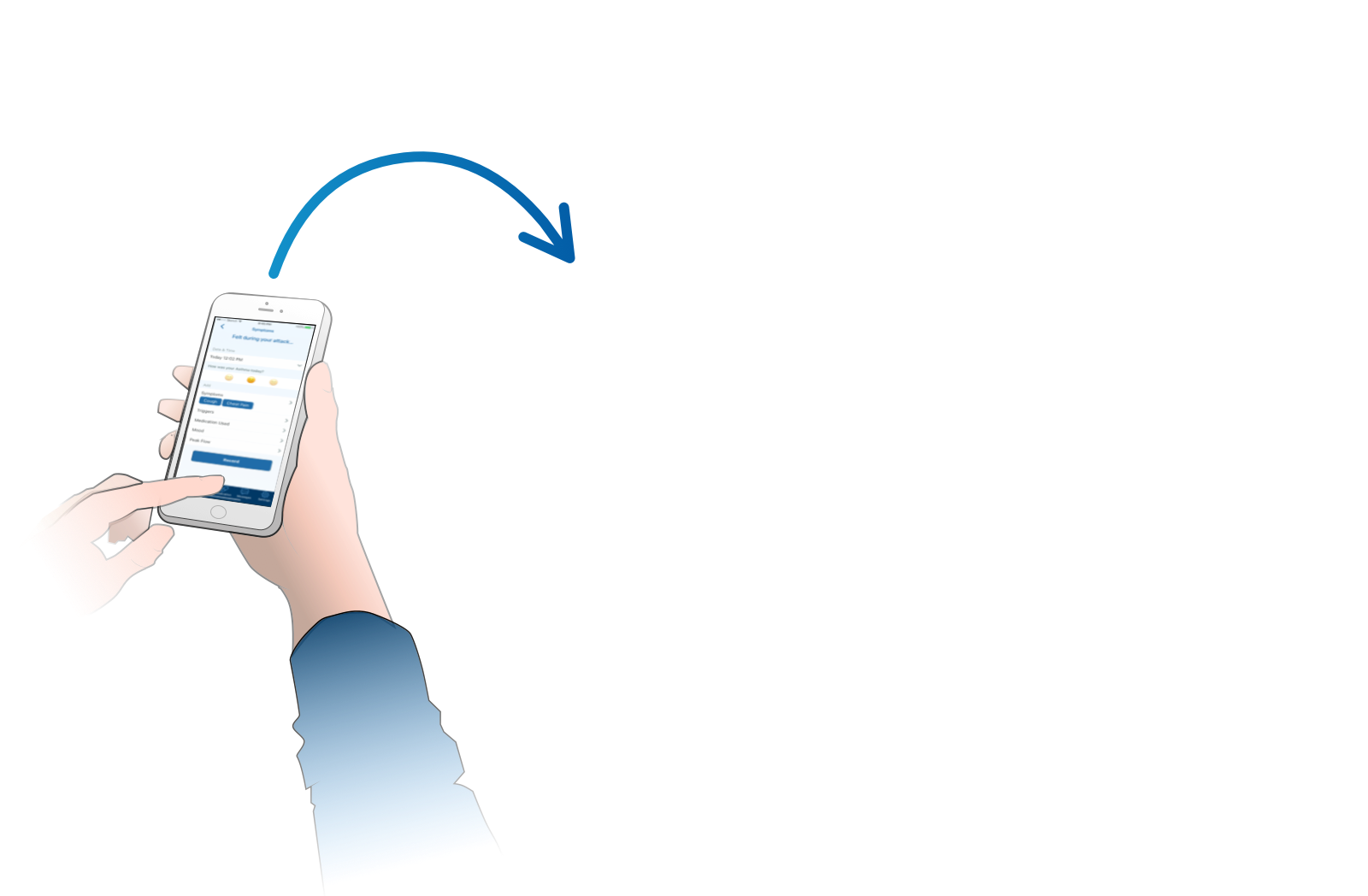
Add Generic Name – Some patient populations refer to their “Rescue Inhaler” as “Albuterol” (the generic name). On the fly, we were able to add the generic name to our Medication Entry Card Component and test to see if we were solving that disconnect.


Component and Widget is crafted with opacities, and the icons are .svg from the platform library. I able to have the front end lead change the color of the icons, the typography, the backplates of the components or the background of the app in we are having contrast or readability or issues.
The Symptoms list was really lacking items patients were looking for and ordering them by importance was not working out. At the end of the first day the UX Researcher and myself regrouped at the hotel and redid the symptoms list. We realized we forgot Chest Tightness!
The most radical changes I began to make was on the Patient History-Info screen in the design files only. I began to rearrange the chart info and order of which we were presenting the symptoms and medication tracking data to the user but nothing was working.
I began to pull some of the patients after their testing session and presented these new designs in Sketch.
Showing charts and data to a patient causes them study.
Nothing was working… we need to simply tell them their data with real words!
Task Cards with averaged results across all the users with meaning quotes from users.
I lead a post testing workshop where the researcher, product manager and myself discuss why each Heuristic category scored the way it did.
I lead the way on trying to brainstorm possible solutions and get the first ideas right into the card.
Why was the Average SUS Score so high when the individual app tasks scored so low?
The patient population is part of a health care network with no main app and the patient portal is extremely out of date. The main feature that pushed the score up was the Air Quality feature. None of the patients knew that daily air pollutants and allergy data were out there.
Rebranding for Partners
Results So Far
The Future

